Quality Camp
︎ Graphic Identity
︎ February 2022
Quality Camp, in Paredes de Coura, is a conference on quality control practices and technologies. It presents itself as an opportunity for the development of synergies and the exchange of knowledge and experiences in the area of quality, between information technologies and the industrial sector. Recognizing that there are few points of contact between software specialists and industrial sectors, this event aims to fill this gap by facilitating dialogue and collaboration between different professionals working in areas related to the quality control of products and processes, through lectures, conversations, debates, and technical visits.
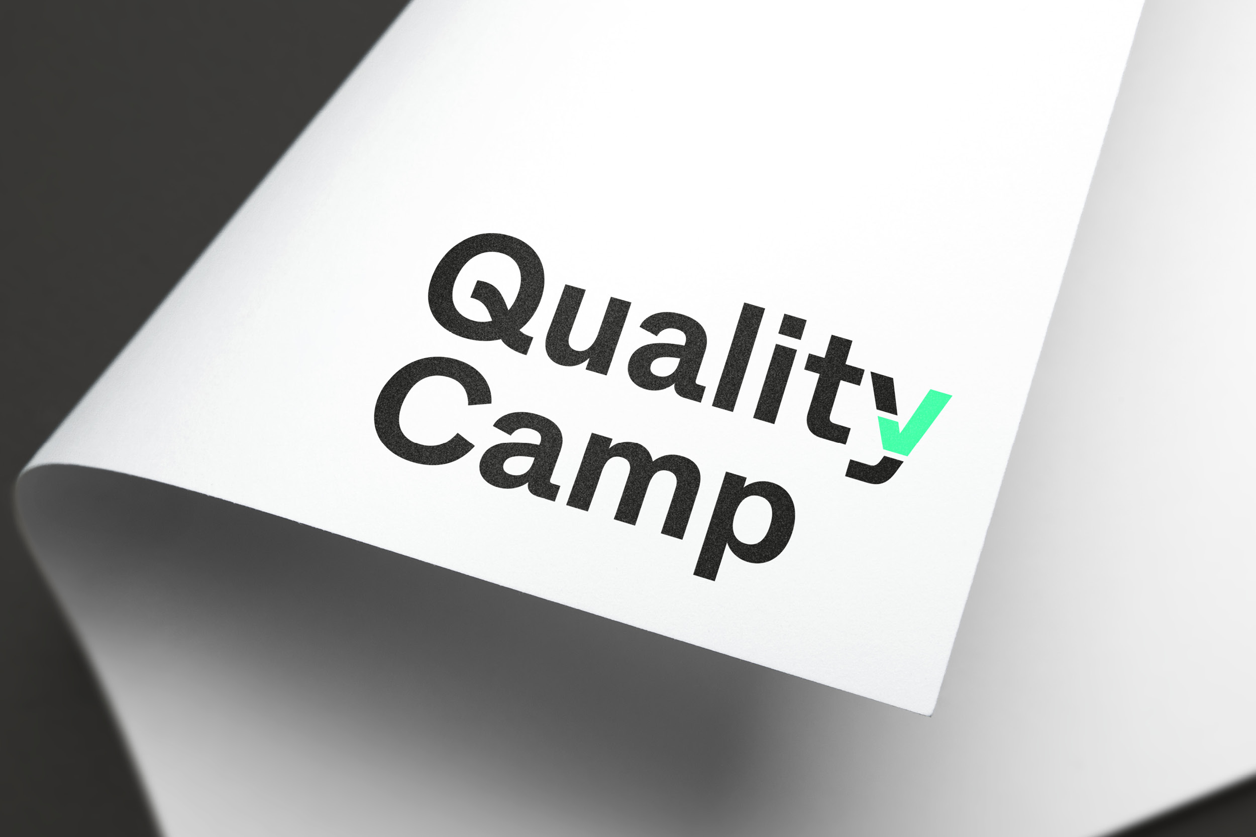
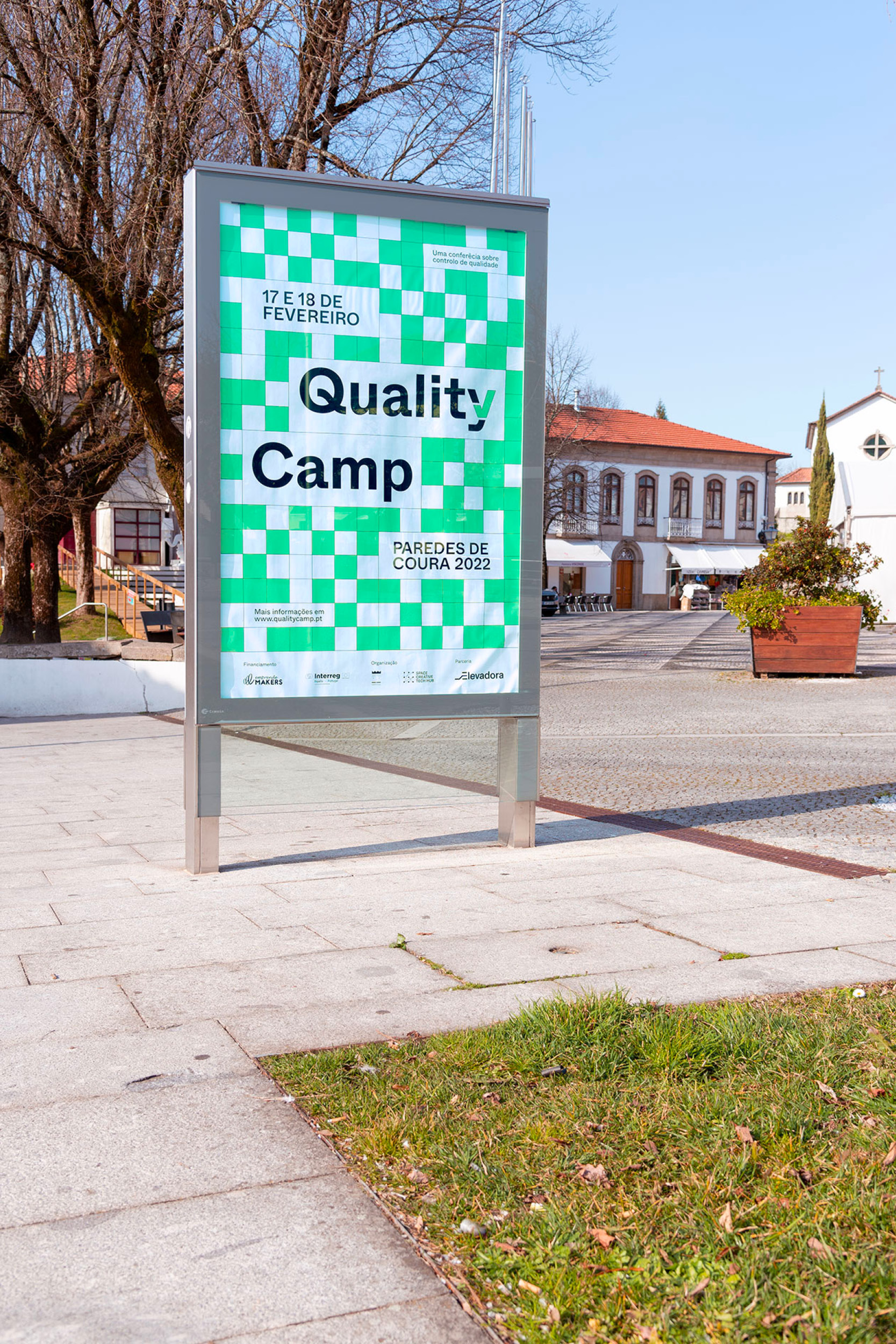
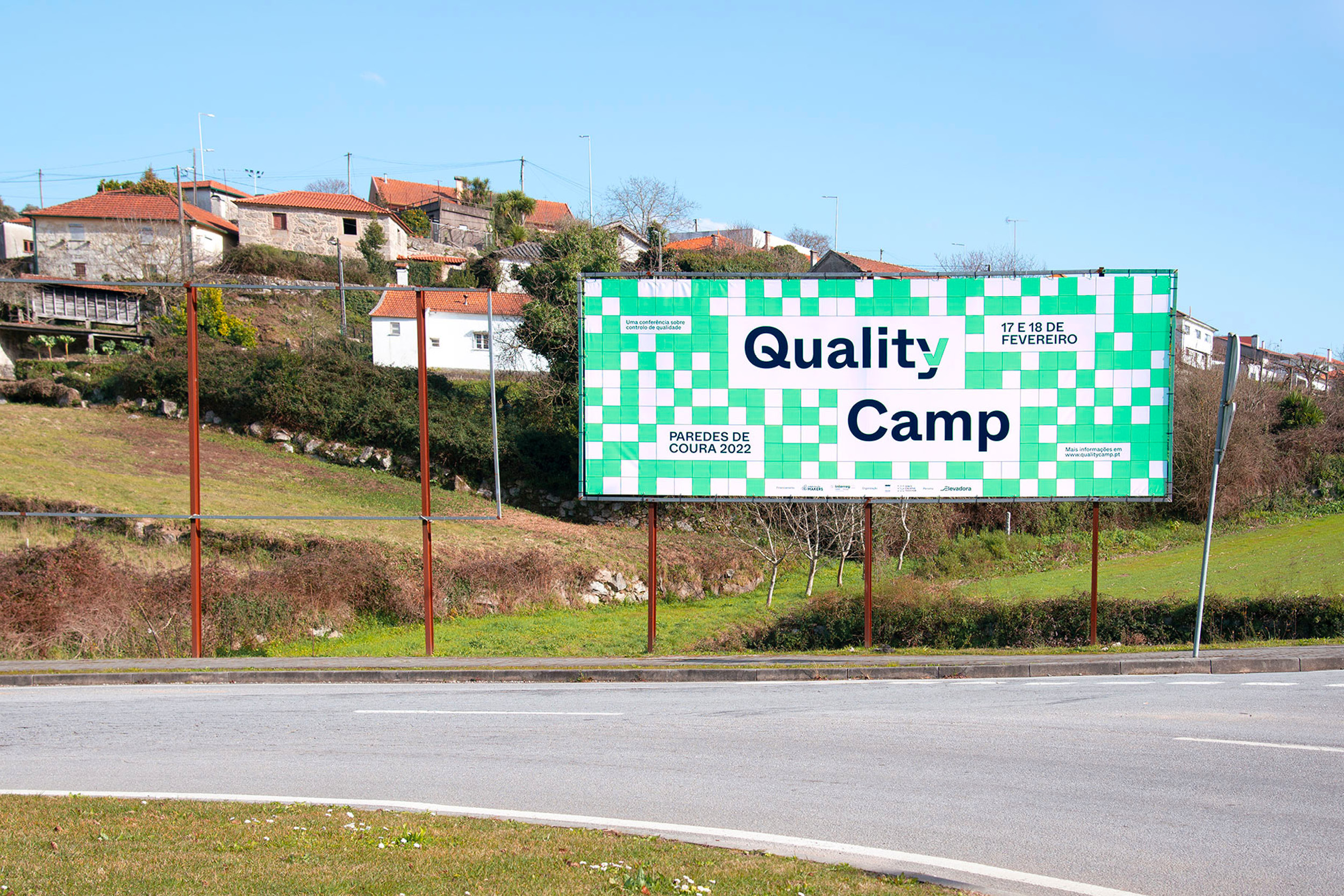
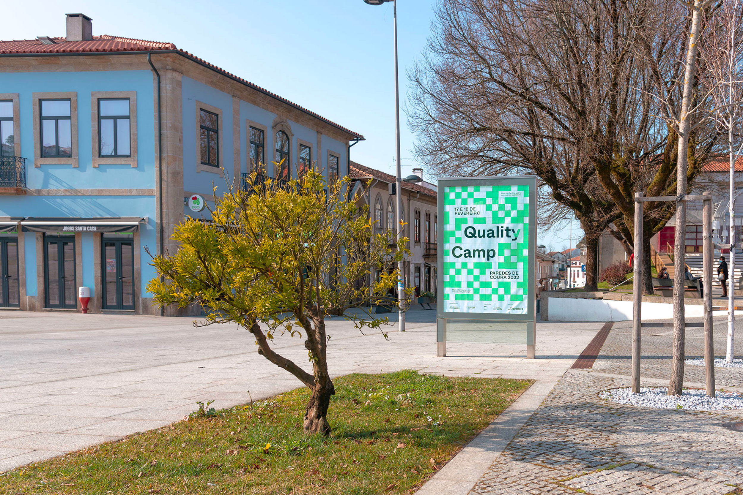
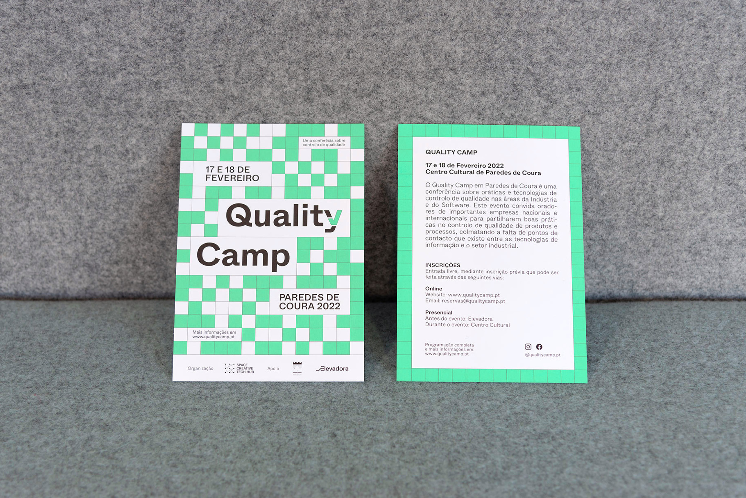
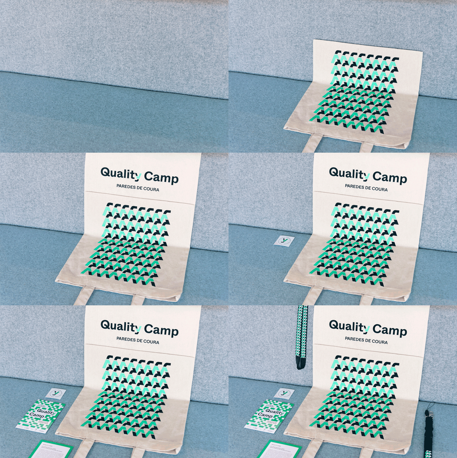
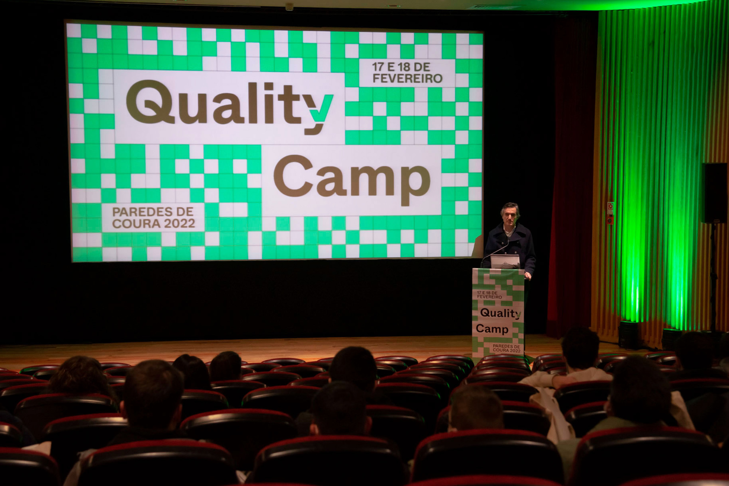
For all these reasons, the choice of green as the main color was quite obvious. Green, a representative of positivity, investment, and growth, was applied along with the various graphic supports that the event required. Like the color, the grid was also an element of enormous visual importance. Appealing to the organizational aspect that Quality Camp intends to encourage, the use of the grid served to explore one of the main concepts of this event. At the same time, the logo, as expected, is also a fundamental part of the project. The “Y”, discreet but bold, is presented with 2 cuts, which intend to refer to the “check” symbol, a visual element easily recognized as a symbol of quality.
For all these reasons, the choice of green as the main color was quite obvious. Green, a representative of positivity, investment, and growth, was applied along with the various graphic supports that the event required. Like the color, the grid was also an element of enormous visual importance. Appealing to the organizational aspect that Quality Camp intends to encourage, the use of the grid served to explore one of the main concepts of this event. At the same time, the logo, as expected, is also a fundamental part of the project. The “Y”, discreet but bold, is presented with 2 cuts, which intend to refer to the “check” symbol, a visual element easily recognized as a symbol of quality.






Concept and Organization:
Space Creative Tech Hub
Creative Direction:
Nuno Alves
Nuno Alves
Program:
Fátima São Simão, Carlos Pestana, Aires Oliveira
Production:
Margarida Meira
Design:
Duarte Tormenta + João Puig
Communication:
Sofia Pancada
Live Streaming:
João de Sá / Neva Films + Paula Santos Jiménez + Filipe Barreiro
Support:
Município de Paredes de Coura