DUARTE TORMENTA
I’m Duarte, a freelance designer from Portugal, based in Zurich, currently working for Adidas.
Selected Work
︎ Quinta do Vesúvio
︎ Daywatch
︎ Space Festival
︎ Onward
︎ Alteration Specialists
︎ Elevadora
︎ Lars von Trier
︎ Quality Camp
︎ Space Ensemble Pack
︎ Voyager
︎ Jazz and Grass
About Me ︎
Current Time:
Scroll Position:
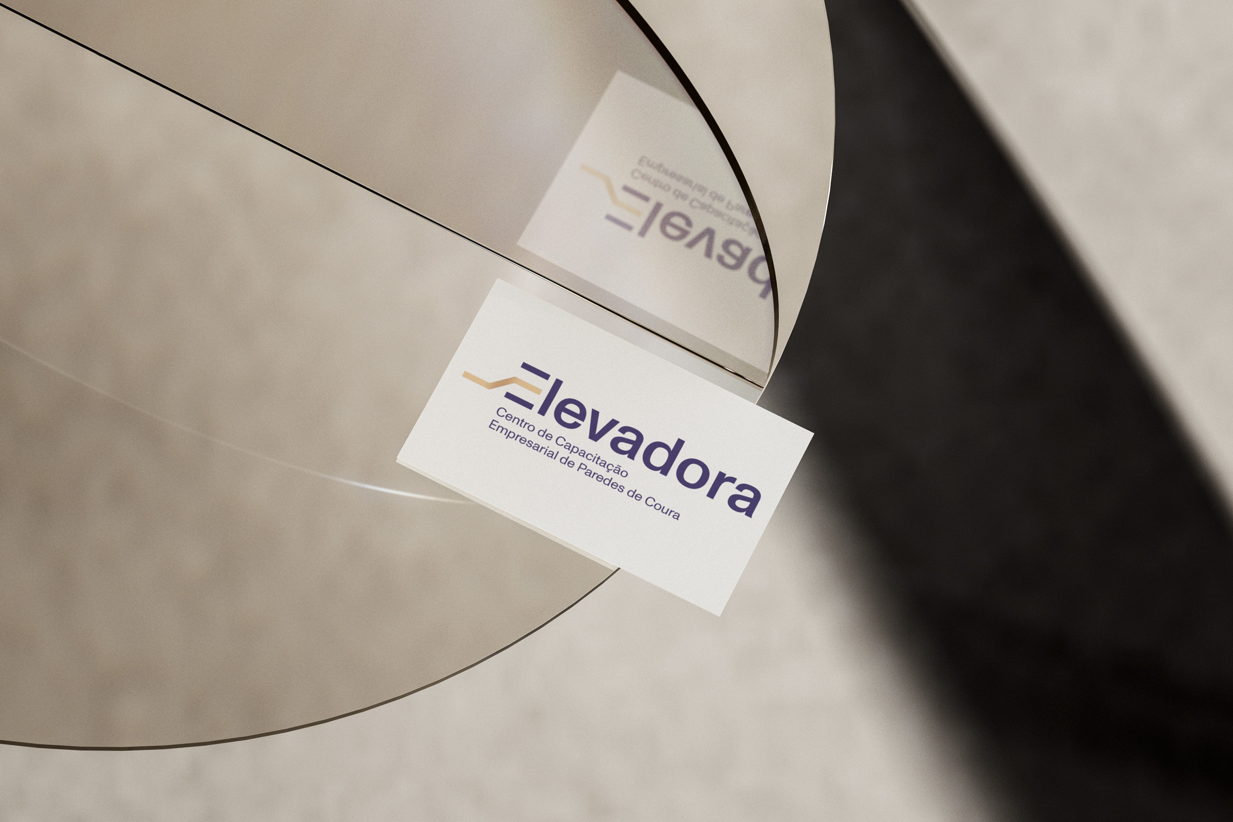
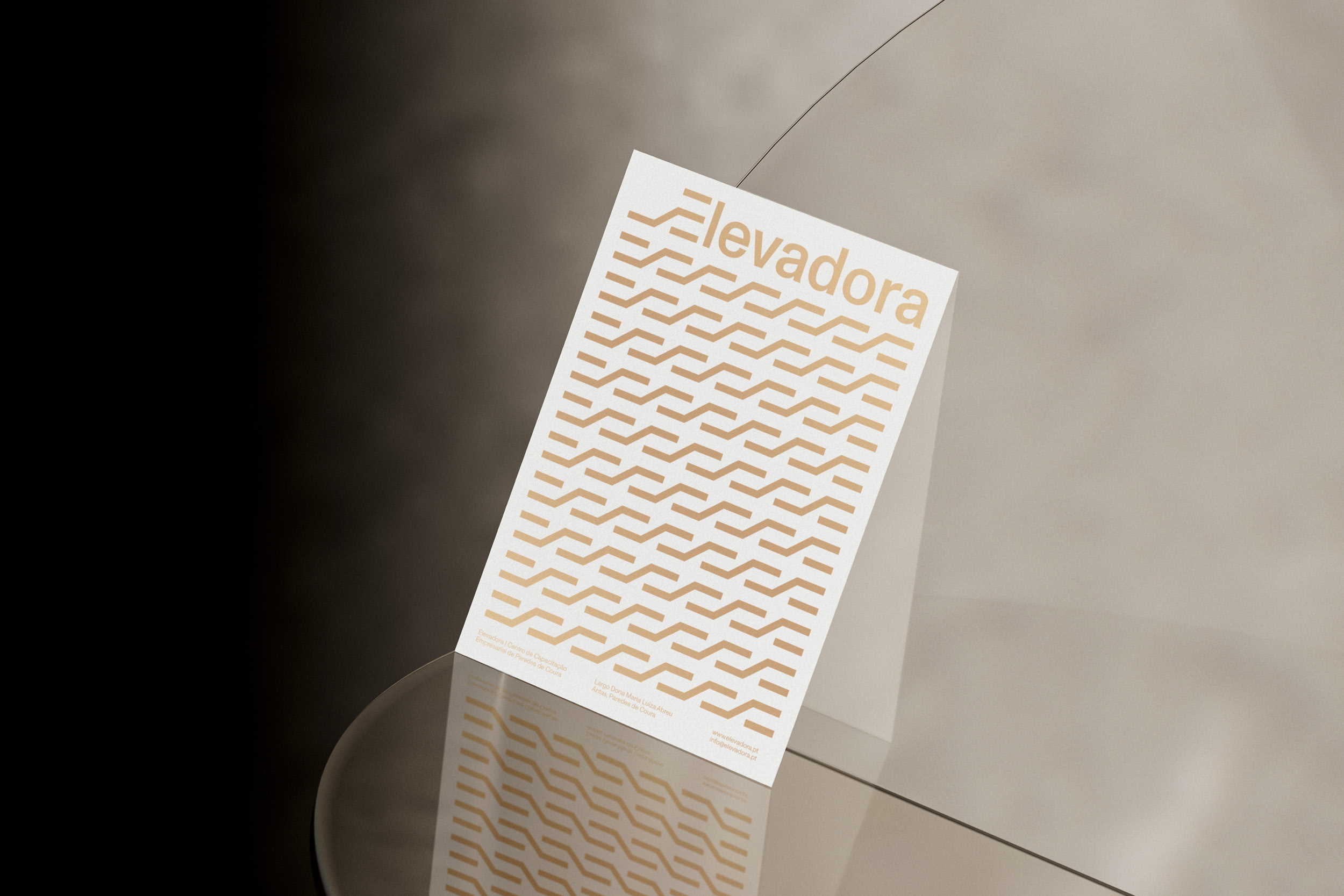
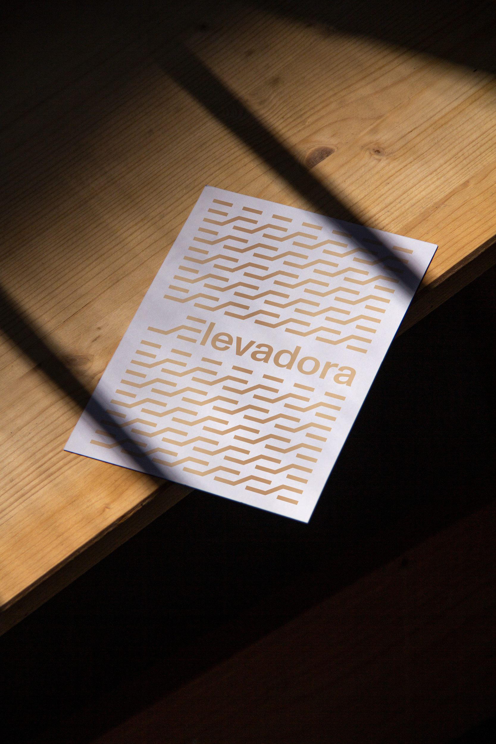
Elevadora:
Centro de Capacitação Empresarial
︎ Brand Identity
︎ March 2021
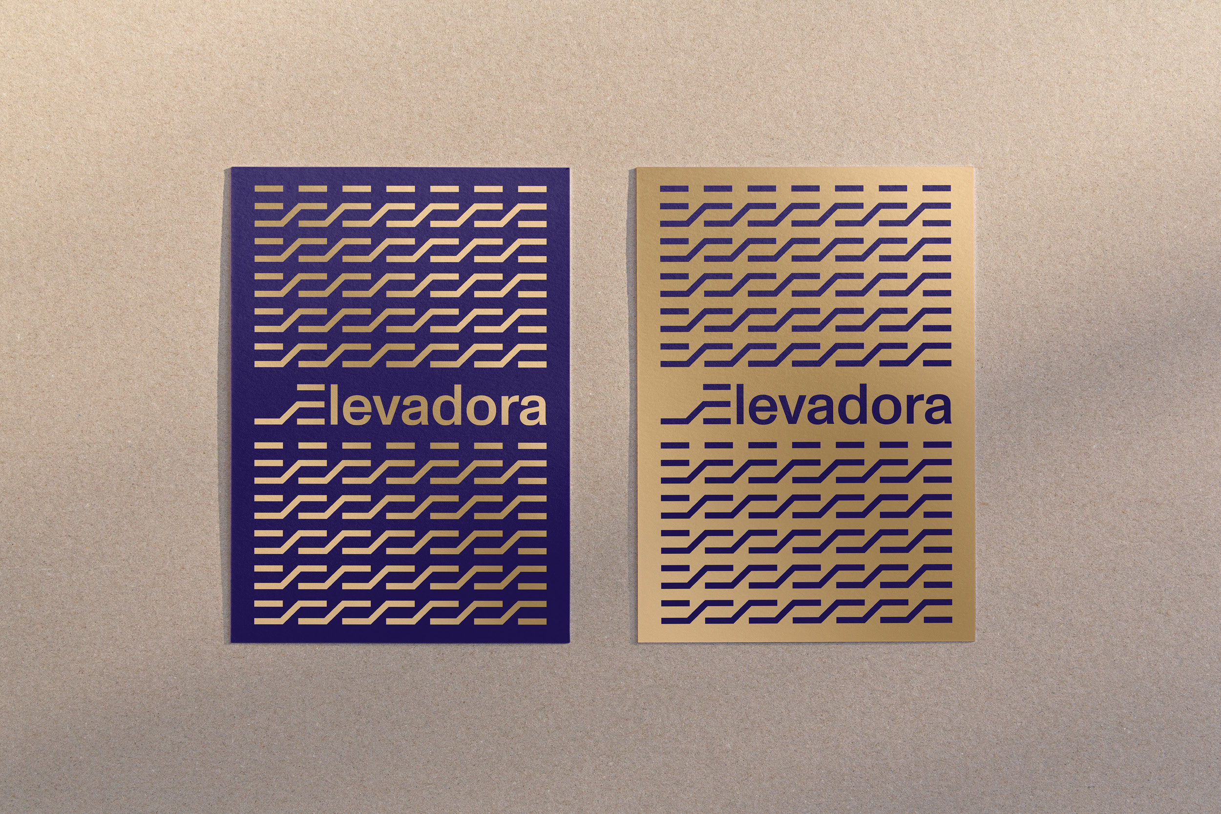
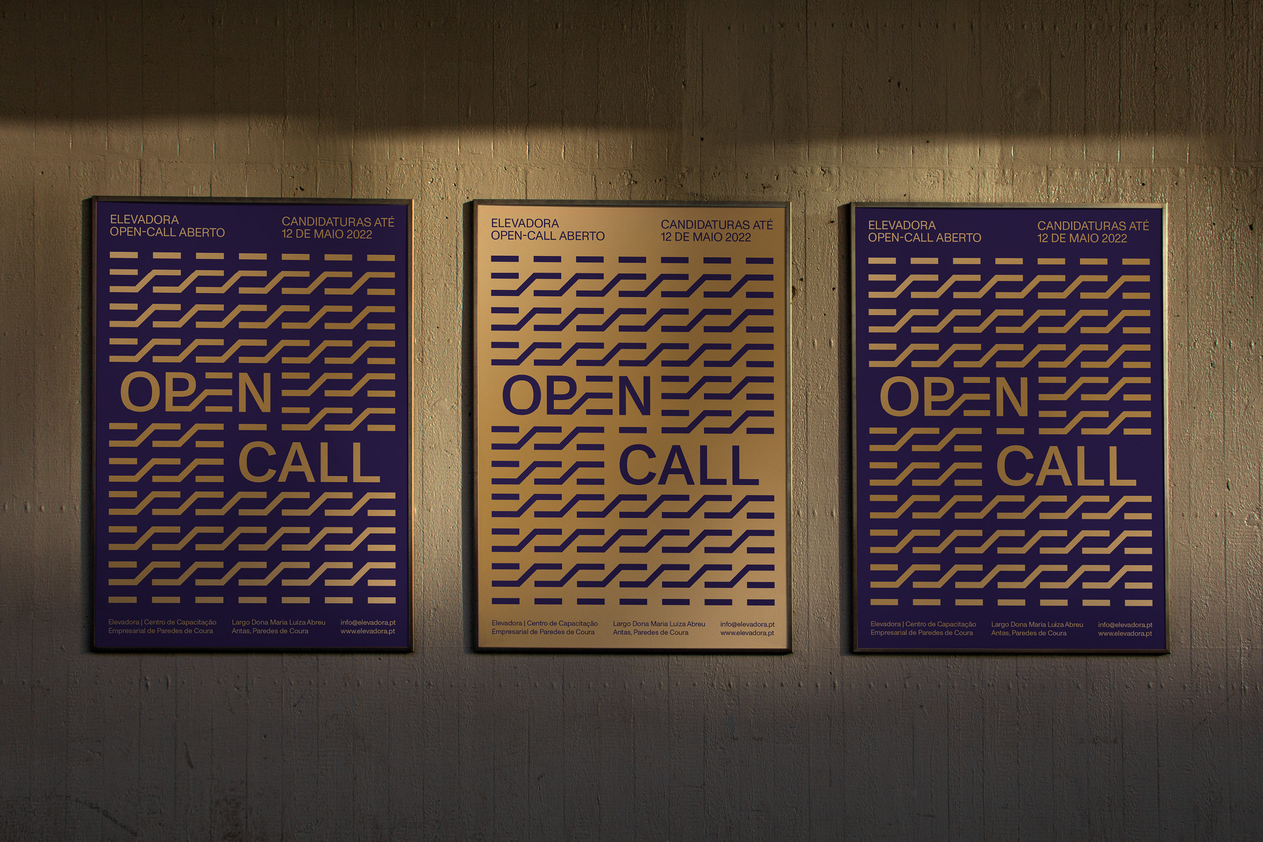
“Elevadora - Centro de Capacitação Empresarial de Paredes de Coura”, is a space dedicated to the incubation and acceleration of technological innovation companies, of a digital nature or that want to improve their presence and performance in this area. The space brings together individual offices, “co-working” and “open-office”, in a building with excellent conditions of functionality and comfort.
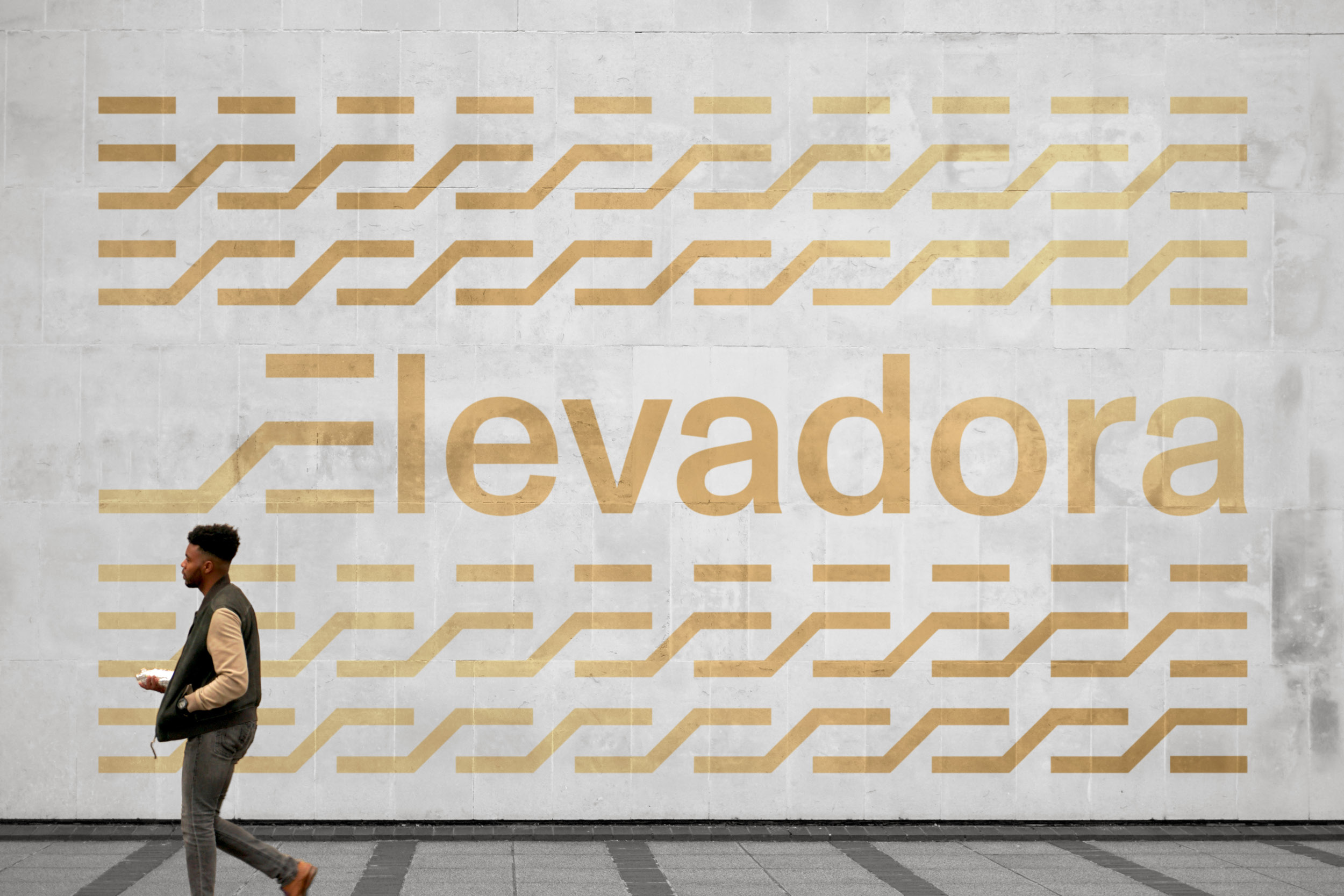
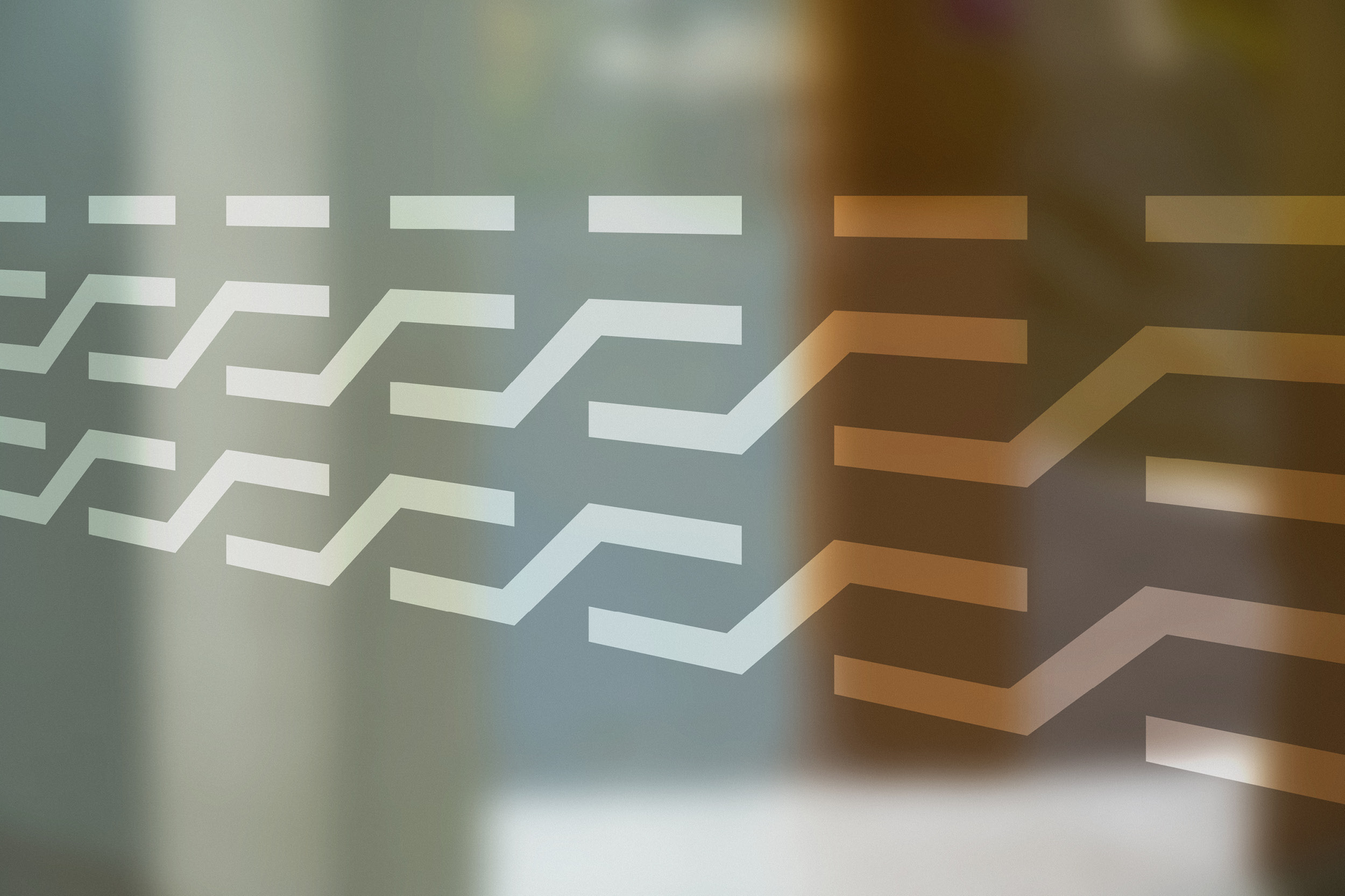
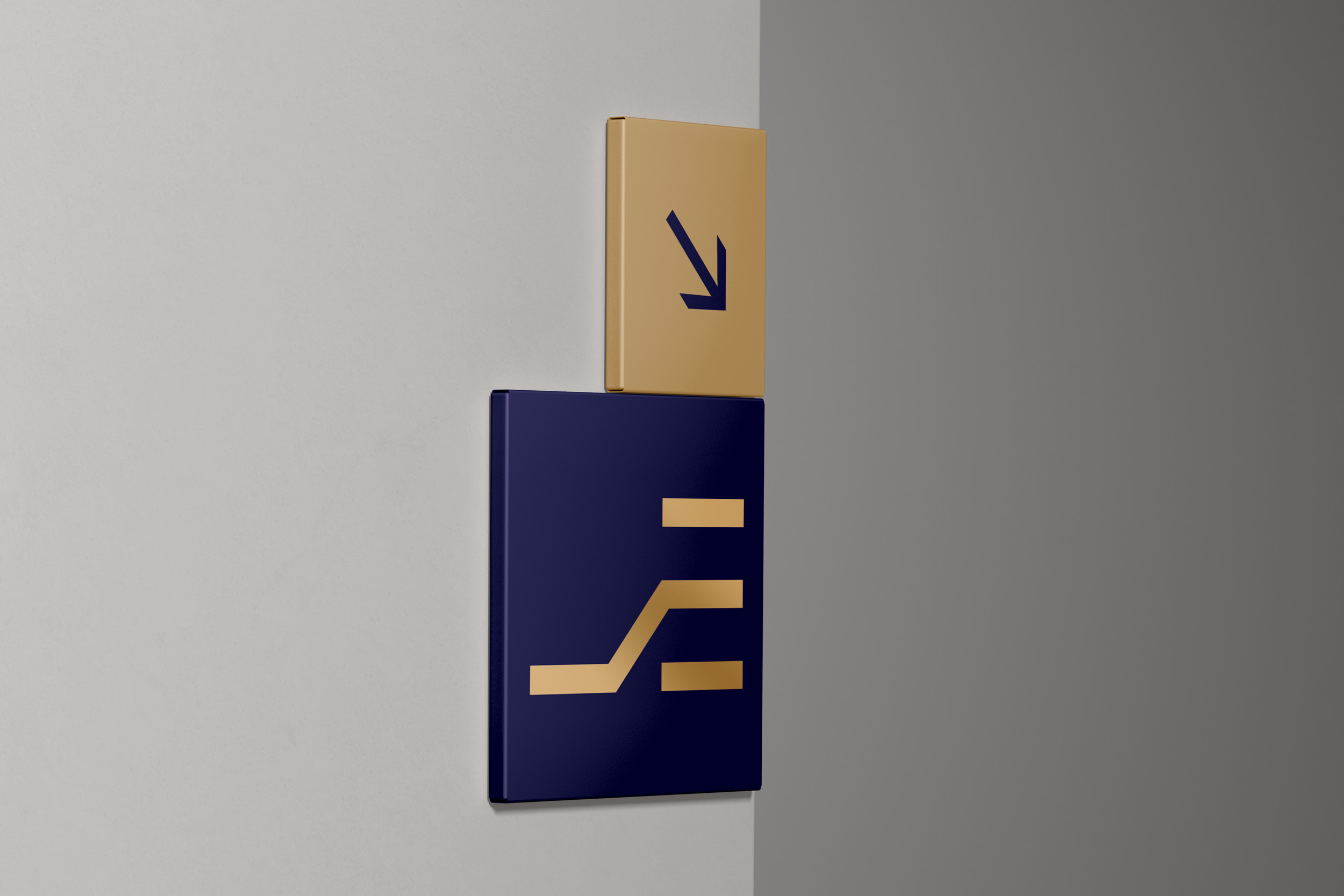
An incubator is a space where companies take their first steps and plant the seed for their growth. The Elevadora logo tries to visually represent this growth within a safe space. Using the “E”, from “Elevadora”, as an icon, this growth is represented by the elevation of the “E”, which rises from a low level, rising to the center. The safe space for this growth is represented by the top and bottom rectangles, which also make the “E”.
The colors that encompass Elevadora’s identity are blue and gold. Blue was chosen because it is a color associated with firmness and stability, a symbol of safe space. Gold, on the other hand, was chosen because it is a color associated with wealth and prosperity, symbolizing growth.


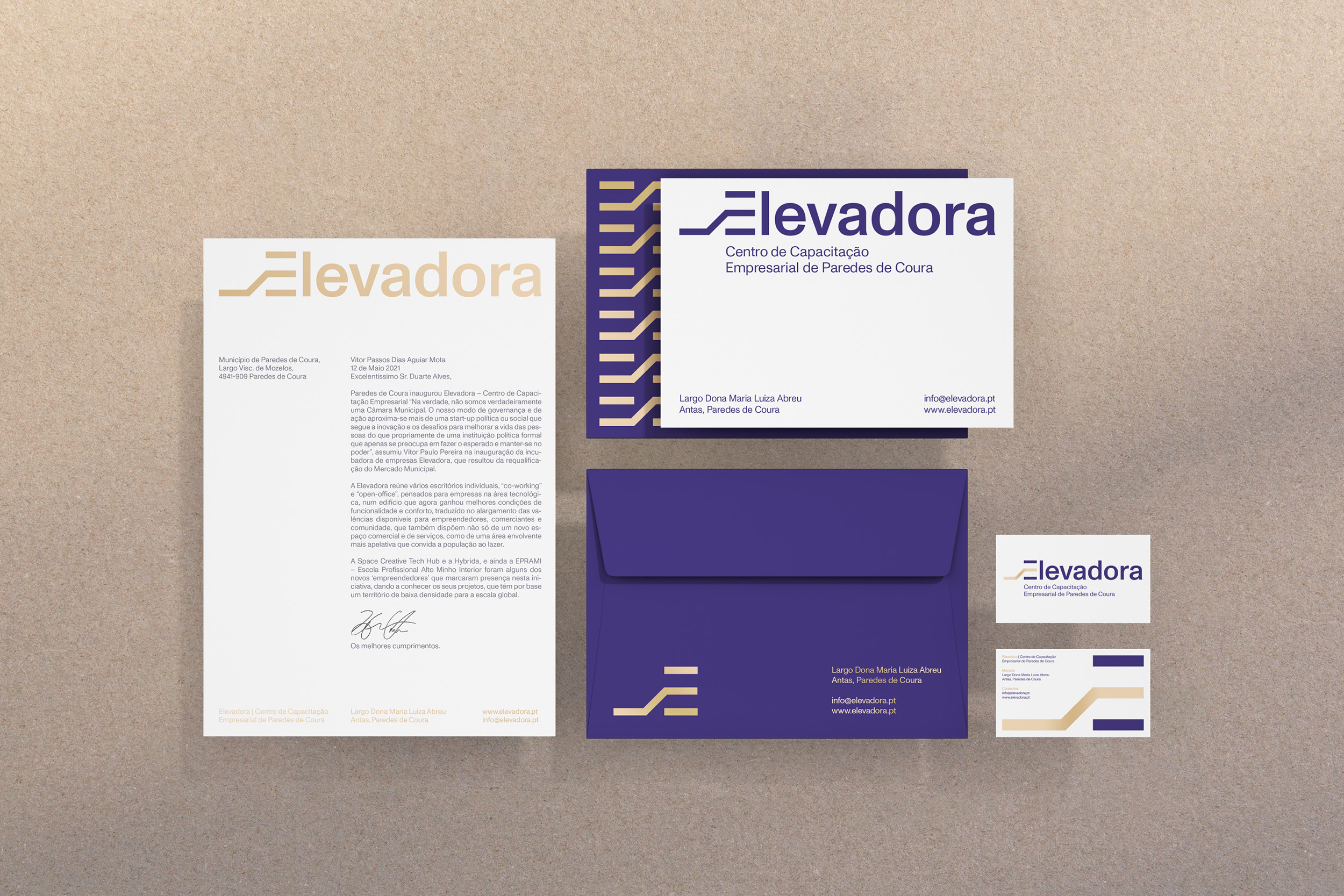


Client:
Município de Paredes de Coura
Creative Direction:
Nuno Alves
Design:
Duarte Tormenta
Communication:
Sofia Pancada